The Resources Facet Filters widget is available when FacetWP is installed. It allows you to pick any of your created Facets and display them on a page for filtering. This is best paired with the Resources Grid widget.
Filter Controls
To first use this widget you need to setup various controls inside the widget. The controls are broken up into different sections.
Title Controls
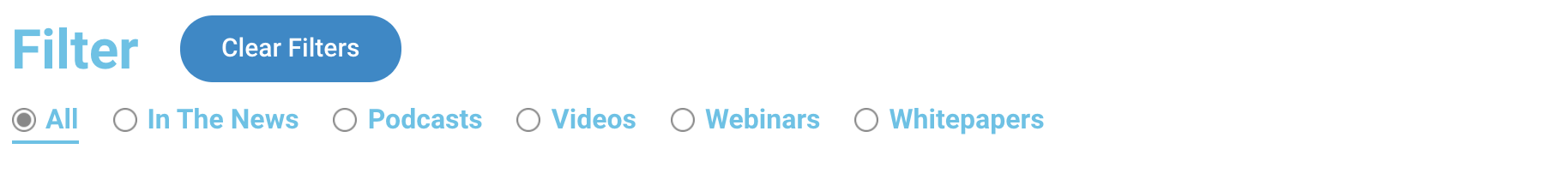
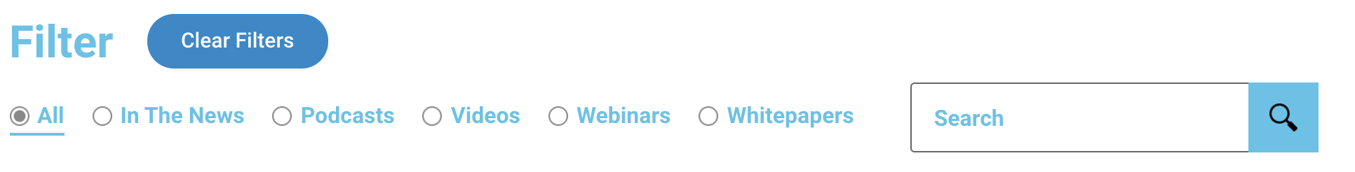
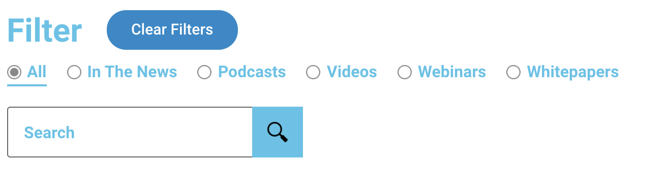
- Title – the text displayed on the page with the filters. Default is “Filter”.
- Title Tag – the HTML tag to use for the text. Default is “H2”.
- Heading Display – this affects the layout. the choices are “Inline with Filters” or “Above Filters”

Facet Filters Controls
This is where you pick and choose your facets to display. You can display 1 or more.
- Filters – click “Add Item” for each filter you want.
- Facet Type – in most cases this can be left as “Facet”. the other options are for more advanced types.
- Select Facet – select from the dropdown the Facet you want to display. This pulls from the list in the backend of FacetWP.
- Facets Display – choose horizontal or vertical to determine the layout the facets will display.
- Facet Styles – To allow style customization for the different types of facets, you need to add each type of facet you are using – for example “radio” and “dropdown” are two types that the default facets are setup as. If you’re not sure which type, check in FacetWP’s backend. Once you add the types here, you’ll be able to customize their styling in the style controls.
- Show Clear Button – this adds a button allowing a user to easily clear all their chosen filter options.
- Clear Button Text – the text for the clear button. Default is “Clear Filters”.
Mobile Flyout Controls
To use the mobile flyout option here, your site needs the FacetWP mobile flyout add-on. This gives the ability for the filters to collapse into a flyout menu on mobile with a button instead of stacking on top of each other.
- Enable Mobile Flyout – turn on or off the mobile flyout option.
- Button Text – once toggled on, you will get the option to enter the text that will display on a button for mobile to open the filters. Default is “Filter”.
Style Controls
This widget contains a lot of style controls that can vary depending on some choices that were set in the filter controls.
Content Style Controls
Title
- Color
- Typography
- Space Below – mostly relevant if using the “Above Filters” option in the Heading Display control
Filters
- Space Between – when using “Horizontal” Facets Display this controls the space between the facets
- Space Below – this controls the space below the facets and applies for both “Horizontal” and “Vertical” Facets Display
Last Filter
This is an option that works best with the “Horizontal” Facets Display. It gives the ability for a divider before the last filter in the horizontal view.
- Add Left Divider – toggle on or off
- Divider Color
- Divider Width
- Divider Height
- Divider Spacing – the space between the divider and the last filter
Varied Facet Styles Controls
After the Content controls, the next few control sections will vary depending on what was entered in the Facet Styles control. Each style selected there will get their own section of controls. The available options are: Radio, Checkboxes, Dropdown, fSelect, and Search.
Radio & Checkboxes Controls
The radio and checkboxes controls will each have their own section. The controls for these 2 are essentially the same, just one controls Radio style facets and the other Checkboxes. Here are the available controls for both of these types:
- Color – default text color of choices
- Hover Color – text color on hover of a choice
- Active Color – text color on the selected filter option
- Show Active Underline – toggle on or off to also use an underline to denote the selected filter option
- Active Underline Color
- Active Underline Width
- Typography
- Radio/Checkbox Alignment – can be vertical or horizontal display
- Space Between – the space between each option, only when using horizontal alignment
- Scrollable – toggle on or off to let the list become scrollable when it becomes too long – only when using horizontal alignment
- Show Radio Button – turn off the circle icon that automatically displays for a radio button to only use the text
- Label/Input Spacing – the space between the radio/checkbox and its text
Dropdown Controls
- Background Color
- Focus Background Color – for accessibility, it is good to set a different background color when a user focuses on the dropdown
- Border Type – selecting anything other than None will bring up controls to change the color and width
- Input Color
- Typography
- Width
- Height
- Dropdown Arrow Image Background Type – this gives the ability to override the default dropdown arrow with a custom image.
fSelect Controls
- Color
- Typography
- Width
- Height
Search Controls
- Background Color
- Border Type – selecting anything other than None will bring up controls to change the color and width
- Input Color
- Placeholder Color
- Typography
- Width
- Height
- Button Background Color
- Button Width
- Button Icon Background Type – this gives the ability to override the default search icon with a custom image
Clear Filters Button
If the Clear Filters button is turned on, these controls allow the styling of it.
- Size – choose between extra small, small, medium, large, extra large
- Padding – override the default button padding
- Margin Left – the button appears next to the Filter Text – this is the space between the two of them
- Add Divider – toggle on or off and then also controls the Color, Width, Height, and Position
- Typography
- Text Color – for normal and hover states
- Background Color – for normal and hover states
- Border Color – for normal and hover states
- Border Width
- Border Radius
Mobile Flyout Button
If the Mobile Flyout is turned on, these controls are for the button that will open the flyout menu on mobile.
- Size – choose between extra small, small, medium, large, extra large
- Typography
- Text Color – for normal and hover states
- Background Color – for normal and hover states
- Border Color – for normal and hover states
- Border Width
- Border Radius
Mobile Flyout
If the Mobile Flyout is turned on, these controls are for styling the flyout itself and the content inside of it.
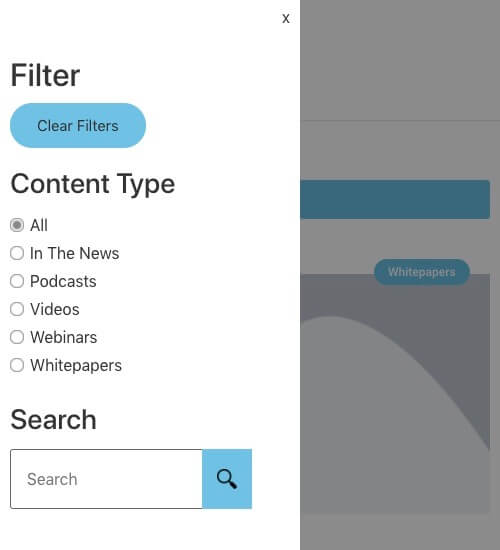
Flyout
- Background Type – set custom background styles to the flyout menu
- Width – can set width to a pixel or percentage amount
- Padding – padding around all the flyout content
- Filters Space Below – control the space below the filters list
Close Button – the styling for the flyout close button
- Color
- Typography
Flyout Heading – this is the heading text at the top of the flyout menu
- Color
- Typography
- Space Below
Clear Filter Button – when the clear filter button is enabled, it will display inside the flyout as well. The controls here are the same as when styling it outside of the flyout, minus the ability to have a divider.
Filter Titles – These controls will style these title of the filter that will display above them.
- Color
- Typography
- Space Below
For Dropdowns and Search facet types, they get the same styling options within the flyout menu as they get in the regular styling including the Button for the Search bar.